
Sunday, May 27, 2012
Breaking in my 7th sketchbook
First illustration in my new sketchbook. Sort of a "showgirls" kind of illustration.

Thursday, May 24, 2012
SCA266: 5 Senses Project
For Photography 1, our assignment was to photograph objects that illustrate the 5 human senses. no body parts allowed, other than that, we had total freedom for this assignment. Here's what I came up with:


GRA210: Personal Flyer

For GRA210 (Graphic Design 1), we were tasked with creating a personal flyer that appeals to potential employers/contacts. The build starting out by assembling a 4 column, 4 row grid. All the elements of the flyer had to align with sections on the grid.
Using the grid was the most challenging part for, not having much experience with using a grid to aid in the design, it was tough for me to figure out how to arrange/align elements properly.
Saturday, May 19, 2012
GRA220: Lawyers Brochure
So this was our final InDesign assignment for Software Training 2 in the Graphic Design program at Seneca College. Definitely the most time consuming out of all of the assignments, however, using paragraph style sheets and A-Master pages really help in formatting the content of the brochure; hammered out about 75% of the brochure in about 90 mins. Total time: 3 hours


Tuesday, May 15, 2012
Graphically translated tools
Planned on using these tools for my "Bad Yellow Pages Ad". Unfortunately, with the wrench already incorporated into the design, this just made the ad look too busy.


Some extra pictures
Shot these while trying to decide which ones to use for my "Rule of Thirds" project.


GRA220: Raptors Survey
This is the first post I've made for my Software Training course, mainly because everything I've built in that course has been relatively straight forward. This Raptors survey project is probably the most challenging one I've encountered thus far. Lot's of finicky formatting of the copy (hanging indents, text wrap, paragraph rule, find and replace, setting tabs etc.) Took about 2 and half hours to complete. A tad frustrating at times, but the end result is quite nice.


Monday, May 14, 2012
SCA266: Contrasts
For our second Photography project, we were given a list of contrasting words that corresponded to each letter in the Alphabet. Since my first name starts with a "G" and my last name starts with an "N", I had to take pictures for Left/Right and Patterned/Plain

Left/Right

Patterned/Plain

Left and Right

Patterned and Plain
Saturday, May 12, 2012
GRA230: Phrases Project
So for my typography 2 course in Graphic Design, we were given a list of 5 phrases: Baggy Jeans, Born to Be Wild, Jumbo Copies, Revolution and Whisper Stutter Shout. Choose 3 of those phrases and set them in 5 different typefaces, ones that convey the meaning of each phrase.


Friday, May 11, 2012
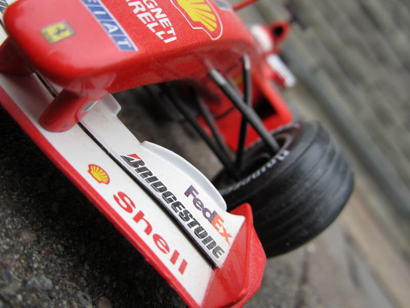
Rule of Thirds
This assignment is for Digital Photography (SCA266) in the Graphic Design program. Any artist out there should be familiar with the Rule of Thirds. It plays a key part in creating an appealing composition whether it's a photograph or an Illustration.
I'm actually kind of excited to be taking a photography course again. It's giving me another opportunity to expand my creativity as well as my own photo library for any future projects.
The subject is a scale model Ferrari F1 car (Can't remember if it's 1:12 or 1:16) that I've owned for almost 10 years now. It's finally being used for something besides sitting on my book shelf looking cool.

Thursday, May 10, 2012
GRA210: 4 Elements of Graphic Design/Bad Yellow Pages Ad
So it's the start of another semester at Seneca College. This semester runs some classes as a "compressed course", meaning that instead of class once a week, we have some classes that run twice a week, but for only 7 of the 14 weeks. So with compressed classes, time management is paramount.
So out first 2 assignments in GRA210 (Graphic Design 1) involved once piece demonstrating the 4 elements of effective design (Contrast, Repetiton, Alignment and Proximity) or CRAP for short. The second one involved selecting one god awful ad from a list and improving vastly on it.


So out first 2 assignments in GRA210 (Graphic Design 1) involved once piece demonstrating the 4 elements of effective design (Contrast, Repetiton, Alignment and Proximity) or CRAP for short. The second one involved selecting one god awful ad from a list and improving vastly on it.
4 Elements of effective design (C.R.A.P project)

Original Bad Ad

Improved Ad

Sunday, May 6, 2012
Last 2 sketchbook creations for now...
So the end of my mini vacation is over. I'm back in school tomorrow morning. These are my last 2 sketchbook pieces for now. I look forward to making more as the semester progresses. At the end of my time off, I've hammered out 18 pieces (drawings/sketches, digital work) in 16 days.


First attempt at the Wolf drawing in the book "Awesome Things to Draw". Will definitely re-visit this one.

Saturday, May 5, 2012

Friday, May 4, 2012
First character trace in a LONG time

Thursday, May 3, 2012

Wednesday, May 2, 2012

Tuesday, May 1, 2012
Another cartoon character
I had a similar version of this character before, it didn't look too great, so I removed the post after a few minutes. Decided it was better to put in more time and effort into the cartoon so I could get it the way I wanted to.


Subscribe to:
Posts (Atom)