Showing posts with label 180. Show all posts

Saturday, April 7, 2012

GRA180: Pattern Project

So this is the final project for Drawing (GRA180). You first have to take a photograph taken by Karl Blossfeldt which you feel could be the base for your pattern design. You then trace the image, simplifying it-remove any unnecessary details. When you're satisfied with your trace, ink it. Use the ink version as your motif and design 4 motifs that demonstrate: translation, reflection, rotation and glide reflection.


Original Image


First Trace


Second Trace: I removed the highlights from both the surface of the plant and the outer edges for this trace. It allowed for some negative space to open up in between the leaves of the plant, which would look better as a graphic translation. Outlined in ink.


Graphic Translation
 This is base for my 4 motifs.

Final Motifs

This is the first real "design" project assigned this semester. Challenging, but rewarding way to cap off the semester.

Glide Reflection
 Reflection


Rotation

Translation
The final task was to combine at least 2 of motifs in order to build a tile for the final pattern. I chose the reflection and translation motifs. The colour palettes were chosen from this website: http://www.pantone.com/pages/fcr.aspx?pg=20948&ca=4

Black and White tile


Colour Tiles


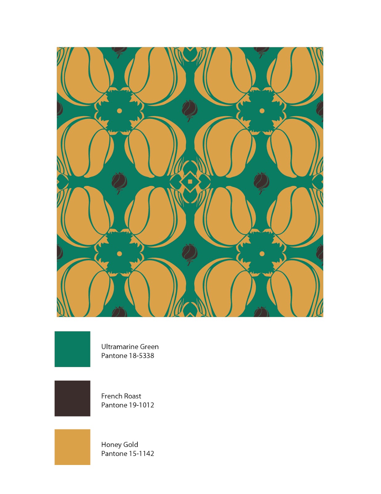
Final pattern designs


Monday, February 6, 2012

GRA180: Hand drawing

I've done more of these drawings in last 3 years than I have in my whole life. This drawing takes me back to 2009 when I was fresh out of highschool and looking to enroll in Art Fundamentals, Animation and Illustration; they required hand drawings either as a portfolio requirement or as part of an on-site drawing test.

What made this drawing interesting was the fact that the hand had to be drawn through a piece of plexiglass, hence why there are white marks on the knuckles of my hands; the sections pressed against the plexiglass. You more or less had to draw while closing one eye, otherwise you'd be trippin' balls trying to get the line work done. Certainly made for some interesting line work, perspective and foreshortening.

The Negative Space project

After working through about 16 thumbnail sketches, I decided on this design. I choose these items because I like the "awkward" shape of the teapot and the curvature of the handles for the tongs. Roughed it out in pencil to get a better idea of the negative space in the composition.

Final copy, black outlines only.

Final copy, solid black using brush pens. I'm fairly happy with the way this composition turned out. I think there's a nice balance between positive and negative space in the composition.