Showing posts with label project. Show all posts

Monday, May 14, 2012

SCA266: Contrasts

For our second Photography project, we were given a list of contrasting words that corresponded to each letter in the Alphabet. Since my first name starts with a "G" and my last name starts with an "N", I  had to take pictures for Left/Right and Patterned/Plain
Left/Right

Patterned/Plain

Left and Right

Patterned and Plain

Saturday, May 12, 2012

GRA230: Phrases Project

So for my typography 2 course in Graphic Design, we were given a list of 5 phrases: Baggy Jeans, Born to Be Wild, Jumbo Copies, Revolution and Whisper Stutter Shout. Choose 3 of those phrases and set them in 5 different typefaces, ones that convey the meaning of each phrase.


Tuesday, April 17, 2012

Size and Scale project

A project from awhile ago. What we had to do was to choose two objects contrasting in form/shape (straight vs. curved etc.), draw them using cross hatching for shading, graphically translate the two objects and then arrange them into 6 different compositions based scaled up/down images.

Cover Page


Basketball Drawing


Graphically Translated Basketball


Combat knife drawing


Graphically Translated combat knife

6 different size compositions. The numbers indicated how much % the ball and knife had to be scaled down and up respectively.


Saturday, April 7, 2012

GRA180: Pattern Project

So this is the final project for Drawing (GRA180). You first have to take a photograph taken by Karl Blossfeldt which you feel could be the base for your pattern design. You then trace the image, simplifying it-remove any unnecessary details. When you're satisfied with your trace, ink it. Use the ink version as your motif and design 4 motifs that demonstrate: translation, reflection, rotation and glide reflection.


Original Image


First Trace


Second Trace: I removed the highlights from both the surface of the plant and the outer edges for this trace. It allowed for some negative space to open up in between the leaves of the plant, which would look better as a graphic translation. Outlined in ink.


Graphic Translation
 This is base for my 4 motifs.

Final Motifs

This is the first real "design" project assigned this semester. Challenging, but rewarding way to cap off the semester.

Glide Reflection
 Reflection


Rotation

Translation
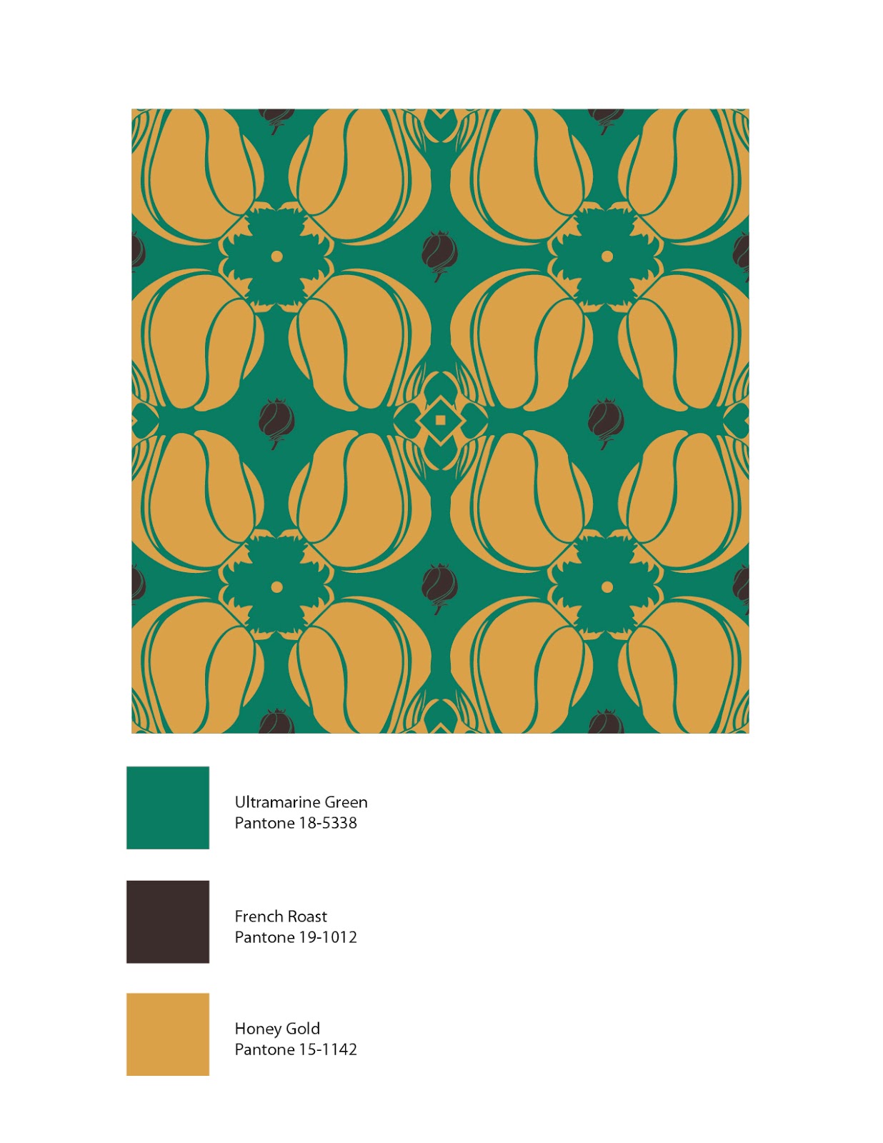
The final task was to combine at least 2 of motifs in order to build a tile for the final pattern. I chose the reflection and translation motifs. The colour palettes were chosen from this website: http://www.pantone.com/pages/fcr.aspx?pg=20948&ca=4

Black and White tile


Colour Tiles


Final pattern designs


Thursday, March 8, 2012

Contrast project GRA 170

For this project, I was given a list of antonyms. My task was to illustrate 16 of those antonyms using a typeface that we have studied this semester (Bodoni, Baskerville, Garamond, Rockwell, Helvetica etc.) and pick a single letter, number or symbol from which ever font you've selected. I chose Bodoni as my font and the number '2' as my character. Bodoni is a very well designed font; I like the positive/negative space created particularly by the '2'. Here's my layout of the 16 illustrations.

Rough Concepts


Final product
The critique went quite well for my particular piece. None of the illustrations needed to be seriously re-done, just a few minor changes here and there.
Some of my favourite ones are the: large/small, concave/convex, beginning/ending, plain/decorative(especially) and subtle/coarse.

Monday, February 13, 2012

Golden Section Visual Research Project

It's been a long time since I've had to do one of these things. I got a few of the pictures I took myself, to use as assets to complete the project. It would be easier to go on to Google Images and just save them to my hard drive, but I figured, I have some of the objects needed to complete the project. Why not use them? It was a great chance to help build up my photo cache as well.

I will admit, I was wrong about this project being boring. It was actually kind of interesting, especially, the "biomimicry" and the "Golden Section in Nature" sections were actually kind of cool to research.


Saturday, February 11, 2012

Final pointillism project

After a few weeks work, here's the final product. Medium: black ink pen. Canvas size: 11x17.

It's a project that can yield some very interesting results. In order to appreciate works like this, you kind of have to stand back a bit and let your eyes mix all the dots together to form a smooth, uniform look of the object (known as optical mixing).

Tuesday, January 31, 2012

Pointillism project: Final Rough concept

Final rough concept for GRA170: Pointillism piece. I made the composition more dynamic by adding more chain aimed downwards as oppose to going just straight across and I added in chain fragments from the broken chain link to increase to feeling of movement in the composition. Next step: Full size on Tabloid paper.